If you’re looking to level up your skills as a software engineer, one thing you need to pay attention to is the importance of giving a great demonstration of new features or code that you’ve created.
If you prefer a video format, you can watch the video version of this article on YouTube:
It boils down to one thing
There’s a single overarching guiding principle that brings all the following advice together.
Remove the distractions
Mistake #1: Screen Resolution
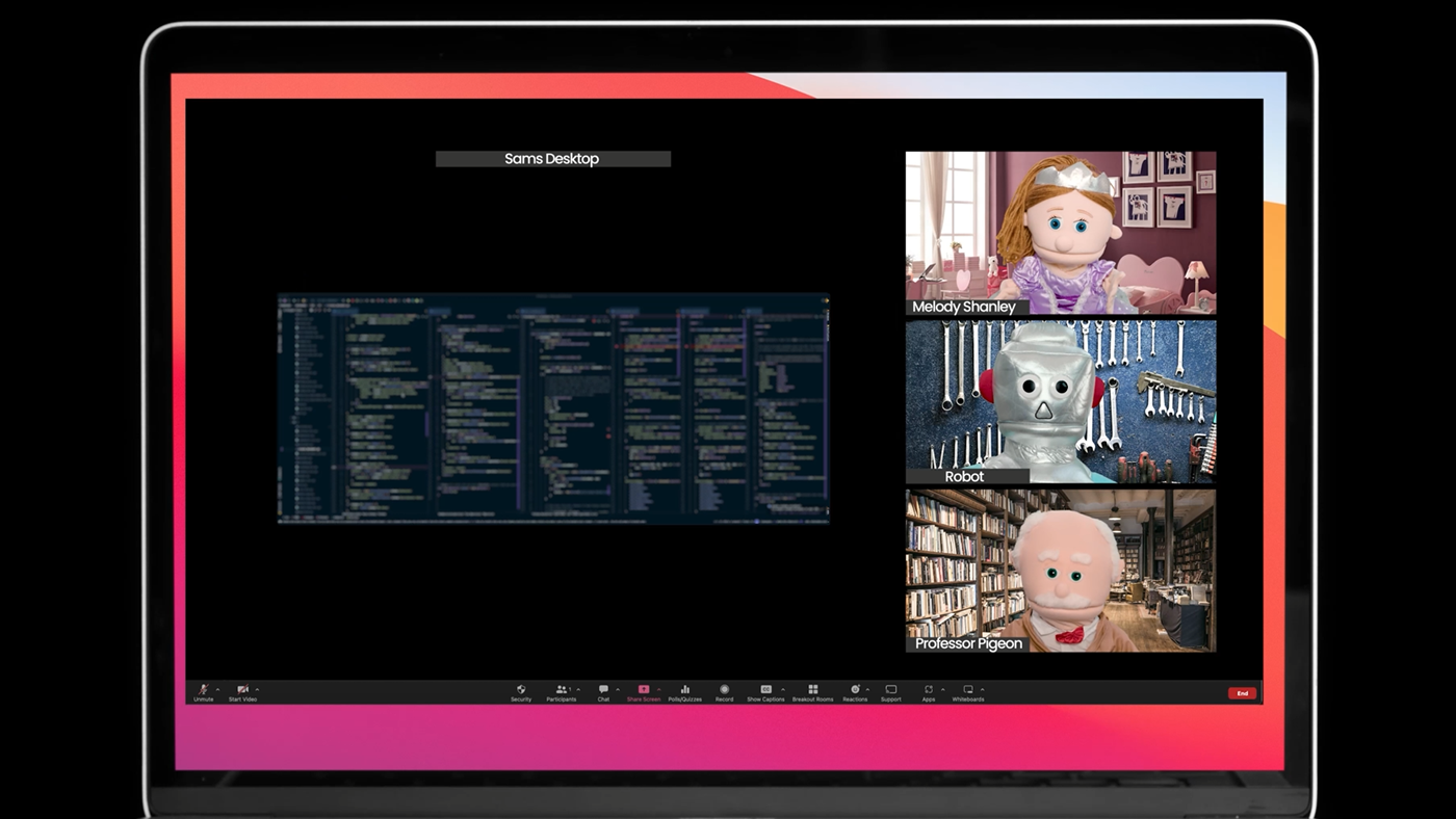
That super rad, ultra high-res widescreen monitor you use for coding doesn’t look so rad when demoing full screen over a video conference. In fact, it really sucks to be on the other end of this.
Many people use a laptop, a tablet, or a phone for video conference calls and meetings (like Zoom or Teams). That ultra-wide super-high res screen looks like a scrambled, compressed mess.
People end up squinting or trying to zoom in to see what it is that’s going on, and the compression used by video conferencing turns everything into a cryptic mess. People need to figure out what to look at and help understand what you’re showing them.
So how can we avoid it?
Zoom in on all the things.
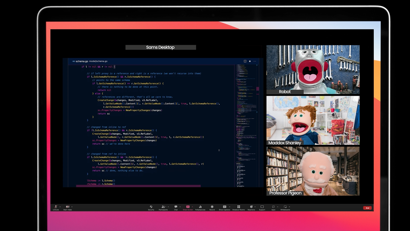
It’s surprising how much more engaged people are when they can actually read your code on a screen. Make it as easy as possible for them to see, zoom in or increase the font size of your code editor.
Ideally, use presentation mode on your IDE if it has one.
Share a single window.
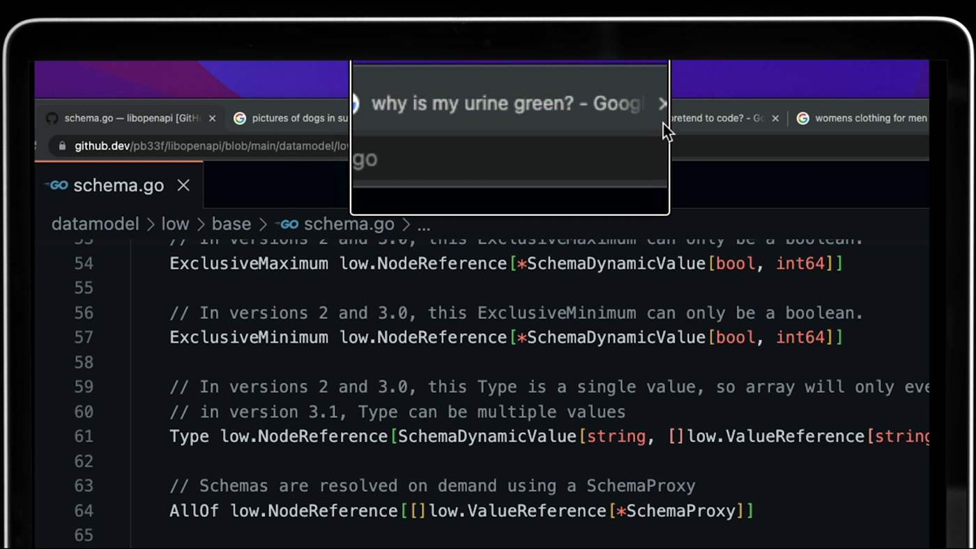
If the demo involves a browser application, just share the tabs you need for the demo.
People will look at your other open browser tabs and be distracted from what you’re showing them.
If you’re using a terminal or IDE, just share the windows you need. Avoid confusing people by making them guess what to pay attention to or where to look.
Both these approaches will help focus the attention of your audience and remove distractions.
Mistake #2: No Script!

Listening to someone monotonically stumble and mumble through a sentence is painful.
There is only one reason this happens during a demo.
No script.
When we need to figure out what to say or think aloud for the first time as we perform something, it generally comes out as a word salad, full of filler words and fluffy, puffy content.
Write a script.
Think about what you’re going to say, write it down, make it clear, and make it crisp!
Use inflection when you talk, inject energy and passion, enunciate your words, and take people on a journey by just the sound of your voice.
Mistake #3 Showcasing APIs using JSON Blobs
Have you ever watched a demo where someone posts a big blob of JSON into a window, presses a button, and a different JSON blob appears next to it?
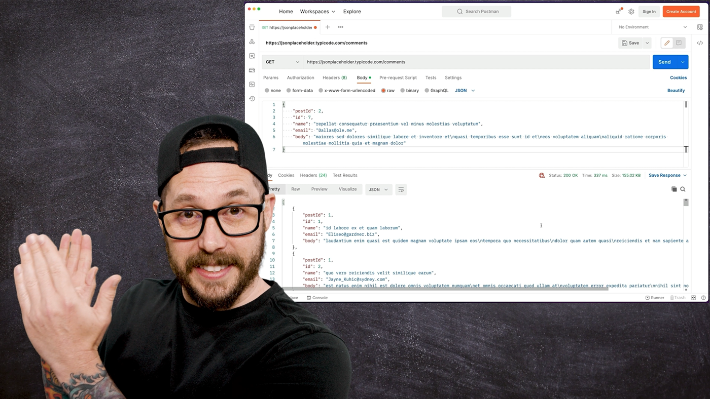
Impressed?
No?, Me either. I don’t think anyone is.
But Why?
As engineers, we spend more time looking at JSON and YAML than we want to. Mainly those people working on creating or consuming APIs.
I mean, that’s all that vacuum does. The same as libopenapi. Over the past decade, I have spent years and years building tools to parse and consume JSON and YAML. I have written parsers, generators, and validators for both formats.
As someone who reads these formats all day, every day, I can tell you that they are not the best way to showcase the value of a new feature.
Seeing blobs of JSON or YAML doesn’t help us understand the value of what the feature is or does.
It just shows the static rendered output of the data that can power the feature.
So how do you showcase the value?
Build a small application or a UI to showcase consuming or engaging with the new API. It can be enough to show the value of the feature.
Aim to render the API result in a way that helps the audience understand why you created the feature, help them understand why it exists.
What you’re trying to showcase, is the value the feature provides to the end-user, the customer. Just showcasing the result of an API call doesn’t help us understand anything other than a blob of data comes out the machine when we feed it.
An end-to-end demonstration of the feature is best, showcasing the end-user experience and the value to the business and the application.
Mistake #4: The Nervous Mouse
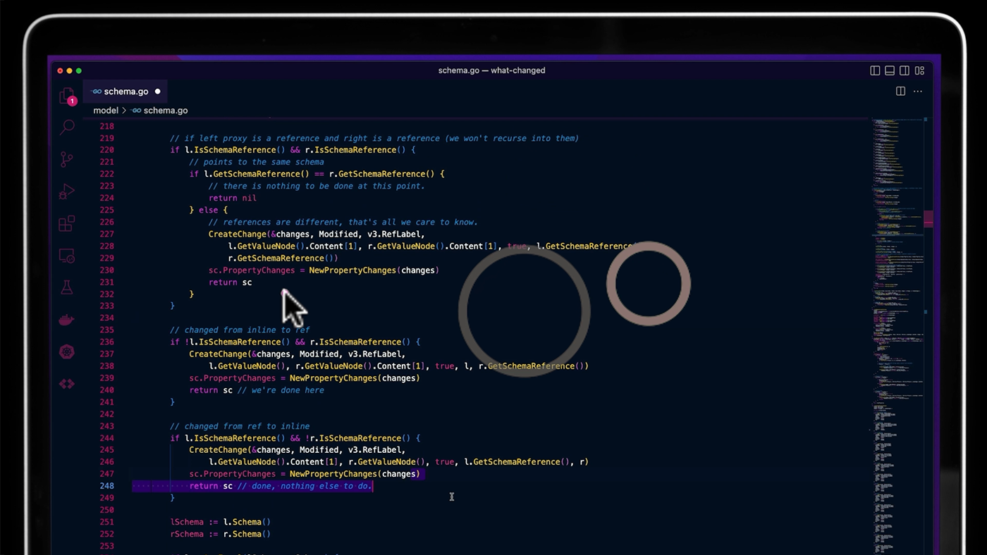
Have you ever tried to follow what someone is saying during a demo…
…but you can’t because they are clicking randomly all over the place, highlighting random text, or just clicking the mouse over and over?
It’s a typical way to expel nervous energy, not unlike nail-biting or leg-jiggling. It helps us focus our minds by giving our hands something to do.
However, it’s really distracting for someone trying to follow a demo.
Your mouse is a laser pointer during a demo
When telling a story during a demo, a mouse pointer guides the eyes and attention of the audience watching. No different from a laser pointer being used to highlight where on a slide people should focus when making points.
People follow the mouse. If the mouse zips left to right, randomly changing icons and random blocks of text are highlighted as we nervously click around, it’s challenging to listen to or follow the narrative.
Be aware of what you’re doing with your hands and where your mouse is.
When people lose sight of the mouse pointer, they start scanning for it, and every second they do that, they are not listening to you or the demo.
Mistake #5: The Virtual Desktop Shuffle
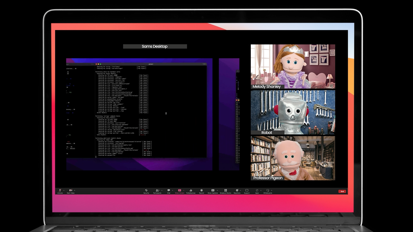
Some of us like to keep different apps on different virtual desktops, browsers, tools, consoles, etc., all nicely separated out.
It makes for a great experience when working alone.
But watching someone flip desktops trying to find the one with the things they need can be excruciating and very distracting
Bringing people along on the journey is essential to giving a good demo. When flipping between desktops, it looks pretty bad over a screen share and distracts the audience as to what they should be paying attention to.
Flipping the screen to a completely different layout and back is a jarring experience for someone else watching.
Keep all the windows needed for the demo on the same desktop.
Remember our guiding principle of Remove the Distractions as you plan your next demo. I hope this has been
useful for you. I certainly enjoyed creating the content.
